| java.lang.Object | |||
| ↳ | android.view.View | ||
| ↳ | android.view.ViewGroup | ||
| ↳ | android.support.constraint.ConstraintLayout | ||
A
ConstraintLayout is a ViewGroup which allows you to position and size widgets in a flexible way.
Note:
ConstraintLayout is available as a support library that you can use on Android systems starting with API level 9 (Gingerbread). As such, we are planning on enriching its API and capabilities over time. This documentation will reflect those changes.
There are currently various types of constraints that you can use:
- Relative positioning
- Margins
- Centering positioning
- Circular positioning
- Visibility behavior
- Dimension constraints
- Chains
- Virtual Helpers objects
Note that you cannot have a circular dependency in constraints.
Also see
ConstraintLayout.LayoutParams for layout attributesDeveloper Guide
Relative positioning
Relative positioning is one of the basic building block of creating layouts in ConstraintLayout. Those constraints allow you to position a given widget relative to another one. You can constrain a widget on the horizontal and vertical axis:
- Horizontal Axis: left, right, start and end sides
- Vertical Axis: top, bottom sides and text baseline
The general concept is to constrain a given side of a widget to another side of any other widget.
For example, in order to position button B to the right of button A (Fig. 1):
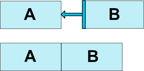
Fig. 1 - Relative Positioning Example
you would need to do:
<Button android:id="@+id/buttonA" ... />
         <Button android:id="@+id/buttonB" ...
                 app:layout_constraintLeft_toRightOf="@+id/buttonA" />
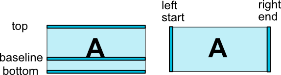
Fig. 2 - Relative Positioning Constraints
Here is the list of available constraints (Fig. 2):
layout_constraintLeft_toLeftOflayout_constraintLeft_toRightOflayout_constraintRight_toLeftOflayout_constraintRight_toRightOflayout_constraintTop_toTopOflayout_constraintTop_toBottomOflayout_constraintBottom_toTopOflayout_constraintBottom_toBottomOflayout_constraintBaseline_toBaselineOflayout_constraintStart_toEndOflayout_constraintStart_toStartOflayout_constraintEnd_toStartOflayout_constraintEnd_toEndOf
They all take a reference
id to another widget, or the parent (which will reference the parent container, i.e. the ConstraintLayout):<Button android:id="@+id/buttonB" ...
app:layout_constraintLeft_toLeftOf="parent" />
Margins
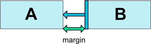
Fig. 3 - Relative Positioning Margins
If side margins are set, they will be applied to the corresponding constraints (if they exist) (Fig. 3), enforcing the margin as a space between the target and the source side. The usual layout margin attributes can be used to this effect:
android:layout_marginStartandroid:layout_marginEndandroid:layout_marginLeftandroid:layout_marginTopandroid:layout_marginRightandroid:layout_marginBottom
Note that a margin can only be positive or equals to zero, and takes a
Dimension.Margins when connected to a GONE widget
When a position constraint target's visibility is
View.GONE, you can also indicate a different margin value to be used using the following attributes:layout_goneMarginStartlayout_goneMarginEndlayout_goneMarginLeftlayout_goneMarginToplayout_goneMarginRightlayout_goneMarginBottom
Centering positioning and bias
A useful aspect of
ConstraintLayout is in how it deals with "impossible" constrains. For example, if we have something like:<android.support.constraint.ConstraintLayout ...>
<Button android:id="@+id/button" ...
app:layout_constraintLeft_toLeftOf="parent"
app:layout_constraintRight_toRightOf="parent/>
</>
Unless the
ConstraintLayout happens to have the exact same size as the Button, both constraints cannot be satisfied at the same time (both sides cannot be where we want them to be).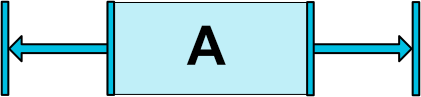
Fig. 4 - Centering Positioning
What happens in this case is that the constraints act like opposite forces pulling the widget apart equally (Fig. 4); such that the widget will end up being centered in the parent container. This will apply similarly for vertical constraints.
Bias
The default when encountering such opposite constraints is to center the widget; but you can tweak the positioning to favor one side over another using the bias attributes:
layout_constraintHorizontal_biaslayout_constraintVertical_bias
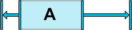
Fig. 5 - Centering Positioning with Bias
For example the following will make the left side with a 30% bias instead of the default 50%, such that the left side will be shorter, with the widget leaning more toward the left side (Fig. 5):
<android.support.constraint.ConstraintLayout ...>
             <Button android:id="@+id/button" ...
                 app:layout_constraintHorizontal_bias="0.3"
                 app:layout_constraintLeft_toLeftOf="parent"
                 app:layout_constraintRight_toRightOf="parent/>
         </>
Circular positioning (Added in 1.1)
You can constrain a widget center relative to another widget center, at an angle and a distance. This allows you to position a widget on a circle (see Fig. 6). The following attributes can be used:
layout_constraintCircle: references another widget idlayout_constraintCircleRadius: the distance to the other widget centerlayout_constraintCircleAngle: which angle the widget should be at (in degrees, from 0 to 360)
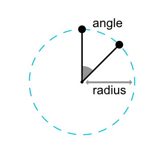
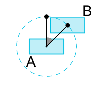
Fig. 6 - Circular Positioning
<Button android:id="@+id/buttonA" ... />
  <Button android:id="@+id/buttonB" ...
      app:layout_constraintCircle="@+id/buttonA"
      app:layout_constraintCircleRadius="100dp"
      app:layout_constraintCircleAngle="45" />
Visibility behavior
ConstraintLayout has a specific handling of widgets being marked as View.GONE.GONE widgets, as usual, are not going to be displayed and are not part of the layout itself (i.e. their actual dimensions will not be changed if marked as GONE).
But in terms of the layout computations,
GONE widgets are still part of it, with an important distinction:- For the layout pass, their dimension will be considered as zero (basically, they will be resolved to a point)
- If they have constraints to other widgets they will still be respected, but any margins will be as if equals to zero
Fig. 7 - Visibility Behavior
This specific behavior allows to build layouts where you can temporarily mark widgets as being
GONE, without breaking the layout (Fig. 7), which can be particularly useful when doing simple layout animations.
Note: The margin used will be the margin that B had defined when connecting to A (see Fig. 7 for an example). In some cases, this might not be the margin you want (e.g. A had a 100dp margin to the side of its container, B only a 16dp to A, marking A as gone, B will have a margin of 16dp to the container). For this reason, you can specify an alternate margin value to be used when the connection is to a widget being marked as gone (see the section above about the gone margin attributes).
Dimensions constraints
Minimum dimensions on ConstraintLayout
You can define minimum and maximum sizes for the
ConstraintLayout itself:android:minWidthset the minimum width for the layoutandroid:minHeightset the minimum height for the layoutandroid:maxWidthset the maximum width for the layoutandroid:maxHeightset the maximum height for the layout
ConstraintLayout when its dimensions are set to WRAP_CONTENT.Widgets dimension constraints
The dimension of the widgets can be specified by setting the
android:layout_width and android:layout_height attributes in 3 different ways:- Using a specific dimension (either a literal value such as
123dpor aDimensionreference) - Using
WRAP_CONTENT, which will ask the widget to compute its own size - Using
0dp, which is the equivalent of "MATCH_CONSTRAINT"
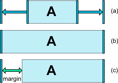
Fig. 8 - Dimension Constraints
Important:
MATCH_PARENT is not recommended for widgets contained in a ConstraintLayout. Similar behavior can be defined by using MATCH_CONSTRAINT with the corresponding left/right or top/bottom constraints being set to "parent".WRAP_CONTENT : enforcing constraints (Added in 1.1)
If a dimension is set to
WRAP_CONTENT, in versions before 1.1 they will be treated as a literal dimension -- meaning, constraints will not limit the resulting dimension. While in general this is enough (and faster), in some situations, you might want to use WRAP_CONTENT, yet keep enforcing constraints to limit the resulting dimension. In that case, you can add one of the corresponding attribute:app:layout_constrainedWidth=”true|false”app:layout_constrainedHeight=”true|false”
MATCH_CONSTRAINT dimensions (Added in 1.1)
When a dimension is set to
MATCH_CONSTRAINT, the default behavior is to have the resulting size take all the available space. Several additional modifiers are available:layout_constraintWidth_minandlayout_constraintHeight_min: will set the minimum size for this dimensionlayout_constraintWidth_maxandlayout_constraintHeight_max: will set the maximum size for this dimensionlayout_constraintWidth_percentandlayout_constraintHeight_percent: will set the size of this dimension as a percentage of the parent
Min and Max
The value indicated for min and max can be either a dimension in Dp, or "wrap", which will use the same value as whatWRAP_CONTENT would do.Percent dimension
To use percent, you need to set the following:- The dimension should be set to
MATCH_CONSTRAINT(0dp) - The default should be set to percent
app:layout_constraintWidth_default="percent"orapp:layout_constraintHeight_default="percent"
(Note: this is necessary in 1.1-beta1 and 1.1-beta2, but will not be needed in following versions if the percent attribute is defined) - Then set the
layout_constraintWidth_percentorlayout_constraintHeight_percentattributes to a value between 0 and 1
Ratio
You can also define one dimension of a widget as a ratio of the other one. In order to do that, you need to have at least one constrained dimension be set to
0dp (i.e., MATCH_CONSTRAINT), and set the attribute layout_constraintDimensionRatio to a given ratio. For example: <Button android:layout_width="wrap_content"
android:layout_height="0dp"
app:layout_constraintDimensionRatio="1:1" />
will set the height of the button to be the same as its width.
The ratio can be expressed either as:
- a float value, representing a ratio between width and height
- a ratio in the form "width:height"
You can also use ratio if both dimensions are set to
MATCH_CONSTRAINT (0dp). In this case the system sets the largest dimensions the satisfies all constraints and maintains the aspect ratio specified. To constrain one specific side based on the dimensions of another, you can pre append W," or H, to constrain the width or height respectively. For example, If one dimension is constrained by two targets (e.g. width is 0dp and centered on parent) you can indicate which side should be constrained, by adding the letter W (for constraining the width) or H (for constraining the height) in front of the ratio, separated by a comma: <Button android:layout_width="0dp"
android:layout_height="0dp"
app:layout_constraintDimensionRatio="H,16:9"
app:layout_constraintBottom_toBottomOf="parent"
app:layout_constraintTop_toTopOf="parent"/>
will set the height of the button following a 16:9 ratio, while the width of the button will match the constraints to parent.Chains
Chains provide group-like behavior in a single axis (horizontally or vertically). The other axis can be constrained independently.
Creating a chain
A set of widgets are considered a chain if they are linked together via a bi-directional connection (see Fig. 9, showing a minimal chain, with two widgets).
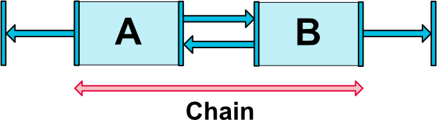
Fig. 9 - Chain
Chain heads
Chains are controlled by attributes set on the first element of the chain (the "head" of the chain):
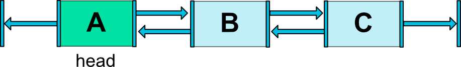
Fig. 10 - Chain Head
The head is the left-most widget for horizontal chains, and the top-most widget for vertical chains.
Margins in chains
If margins are specified on connections, they will be taken in account. In the case of spread chains, margins will be deducted from the allocated space.
Chain Style
When setting the attribute
layout_constraintHorizontal_chainStyle or layout_constraintVertical_chainStyle on the first element of a chain, the behavior of the chain will change according to the specified style (default is CHAIN_SPREAD).CHAIN_SPREAD-- the elements will be spread out (default style)- Weighted chain -- in
CHAIN_SPREADmode, if some widgets are set toMATCH_CONSTRAINT, they will split the available space CHAIN_SPREAD_INSIDE-- similar, but the endpoints of the chain will not be spread outCHAIN_PACKED-- the elements of the chain will be packed together. The horizontal or vertical bias attribute of the child will then affect the positioning of the packed elements
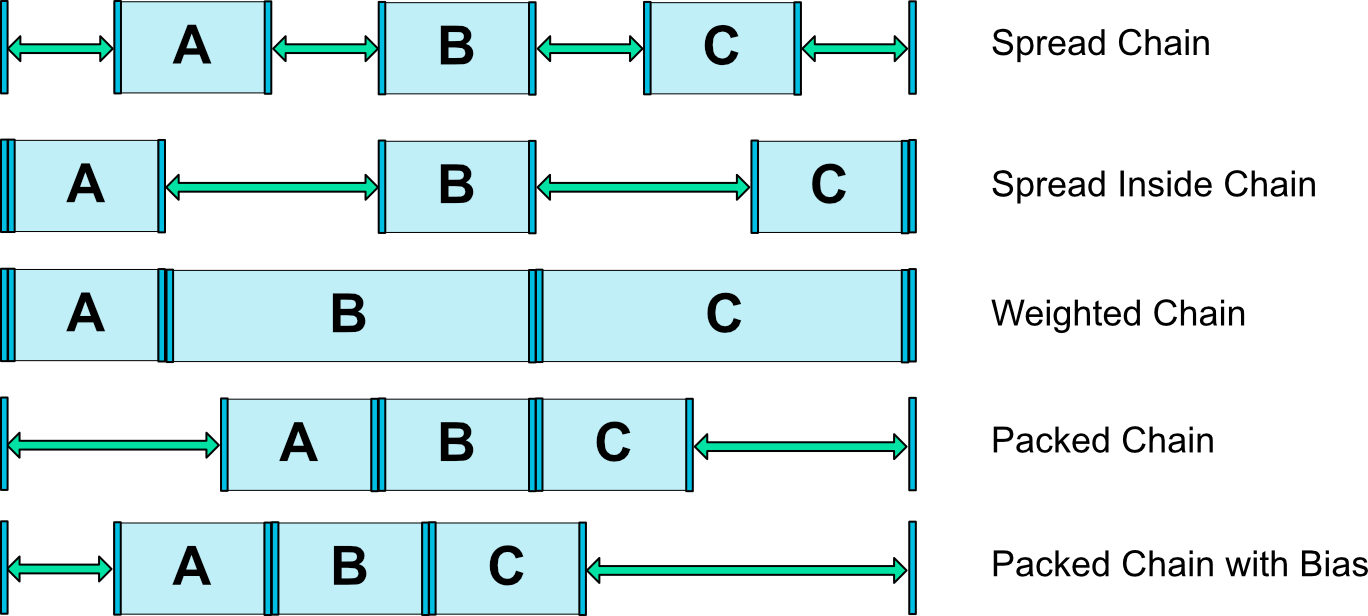
Fig. 11 - Chains Styles
Weighted chains
The default behavior of a chain is to spread the elements equally in the available space. If one or more elements are using
MATCH_CONSTRAINT, they will use the available empty space (equally divided among themselves). The attribute layout_constraintHorizontal_weight and layout_constraintVertical_weight will control how the space will be distributed among the elements using MATCH_CONSTRAINT. For exemple, on a chain containing two elements using MATCH_CONSTRAINT, with the first element using a weight of 2 and the second a weight of 1, the space occupied by the first element will be twice that of the second element.Virtual Helper objects
In addition to the intrinsic capabilities detailed previously, you can also use special helper objects in
ConstraintLayout to help you with your layout. Currently, the Guideline object allows you to create Horizontal and Vertical guidelines which are positioned relative to the ConstraintLayout container. Widgets can then be positioned by constraining them to such guidelines. In 1.1, Barrier and Group were added too.
See also:
Summary
Nested classes | |
|---|---|
class | ConstraintLayout.LayoutParamsThis class contains the different attributes specifying how a view want to be laid out inside a ConstraintLayout. |
Inherited constants |
|---|
 From class From class android.view.ViewGroup |
From class android.view.View |
Inherited fields |
|---|
From class android.view.View |
Public constructors | |
|---|---|
ConstraintLayout(Context context) | |
ConstraintLayout(Context context, AttributeSet attrs) | |
ConstraintLayout(Context context, AttributeSet attrs, int defStyleAttr) | |
Public methods | |
|---|---|
int | getMaxHeight()The maximum height of this view. |
int | getMaxWidth() |
int | getMinHeight()The minimum height of this view. |
int | getMinWidth()The minimum width of this view. |
void | requestLayout() |
void | setConstraintSet(ConstraintSet set)Sets a ConstraintSet object to manage constraints. |
void | setMaxHeight(int value)Set the max height for this view |
void | setMaxWidth(int value)Set the max width for this view |
void | setMinHeight(int value)Set the min height for this view |
void | setMinWidth(int value)Set the min width for this view |
Protected methods | |
|---|---|
boolean | checkLayoutParams(ViewGroup.LayoutParams p) |
ConstraintLayout.LayoutParams | generateDefaultLayoutParams() |
ViewGroup.LayoutParams | generateLayoutParams(ViewGroup.LayoutParams p) |
void | onLayout(boolean changed, int left, int top, int right, int bottom) |
void | onMeasure(int widthMeasureSpec, int heightMeasureSpec) |
Inherited methods | |
|---|---|
From class android.view.ViewGroup | |
From class android.view.View | |
From class java.lang.Object | |
From interface android.view.ViewParent | |
From interface android.view.ViewManager | |
From interface android.graphics.drawable.Drawable.Callback | |
From interface android.view.KeyEvent.Callback | |
From interface android.view.accessibility.AccessibilityEventSource | |
Public constructors
ConstraintLayout
ConstraintLayout (Context context,
                AttributeSet attrs)
| Parameters | |
|---|---|
context | Context |
attrs | AttributeSet |
ConstraintLayout
ConstraintLayout (Context context,
                AttributeSet attrs,
                int defStyleAttr)
| Parameters | |
|---|---|
context | Context |
attrs | AttributeSet |
defStyleAttr | int |
Public methods
getMaxHeight
int getMaxHeight ()
The maximum height of this view.
| Returns | |
|---|---|
int | The maximum height of this view |
See also:
getMaxWidth
int getMaxWidth ()
| Returns | |
|---|---|
int | |
getMinHeight
int getMinHeight ()
The minimum height of this view.
| Returns | |
|---|---|
int | The minimum height of this view |
See also:
getMinWidth
int getMinWidth ()
The minimum width of this view.
| Returns | |
|---|---|
int | The minimum width of this view |
See also:
requestLayout
void requestLayout ()
setConstraintSet
void setConstraintSet (ConstraintSet set)
Sets a ConstraintSet object to manage constraints. The ConstraintSet overrides LayoutParams of child views.
| Parameters | |
|---|---|
set | ConstraintSet: Layout children using ConstraintSet |
setMaxHeight
void setMaxHeight (int value)
Set the max height for this view
setMaxWidth
void setMaxWidth (int value)
Set the max width for this view
setMinHeight
void setMinHeight (int value)
Set the min height for this view
setMinWidth
void setMinWidth (int value)
Set the min width for this view
Protected methods
checkLayoutParams
boolean checkLayoutParams (ViewGroup.LayoutParams p)
| Parameters | |
|---|---|
p | ViewGroup.LayoutParams |
| Returns | |
|---|---|
boolean | |
generateDefaultLayoutParams
ConstraintLayout.LayoutParams generateDefaultLayoutParams ()
| Returns | |
|---|---|
ConstraintLayout.LayoutParams | |
generateLayoutParams
ViewGroup.LayoutParams generateLayoutParams (ViewGroup.LayoutParams p)
| Parameters | |
|---|---|
p | ViewGroup.LayoutParams |
| Returns | |
|---|---|
ViewGroup.LayoutParams | |
onLayout
void onLayout (boolean changed,
                int left,
                int top,
                int right,
                int bottom)
| Parameters | |
|---|---|
changed | boolean |
left | int |
top | int |
right | int |
bottom | int |
onMeasure
void onMeasure (int widthMeasureSpec,
                int heightMeasureSpec)
| Parameters | |
|---|---|
widthMeasureSpec | int |
heightMeasureSpec | int |


No comments:
Post a Comment